Thoughts on The Hobbit: The Desolation of Smaug (SPOILERS)

My second time viewing The Desolation of Smaug – in the HFR version – hasn’t caused me to change my views which were spelled out in the review. I never bemoaned the length of the three movies in Peter Jackson’s Lord of the Rings adaptation, and found An Unexpected Journey quite enjoyable despite some issues. But Desolation‘s problems outweigh its positives, and here I’m looking to elaborate on them in greater detail, full of spoilers from top to bottom.

In Tolkien’s The Hobbit, Bilbo and the dwarves’ meeting with Beorn, as well as the Mirkwood section ending with the barrel ride escape from Thranduil form an important part of the overall text. For this current trilogy of movies, Beorn is pretty much set up to be what the Ents were in LOTR: a mysterious and powerful agent of nature whose reservations about aiding the protagonists are overcome by a sheer hatred of orcs. The chapter in the book, ‘Queer Lodgings’, is by turns funny, sinister, dramatic and exciting, and its standout nature is testified by fan devotion to Beorn’s character throughout the years. But whereas The Two Towers devoted considerable amount of time to Treebeard, Desolation has little more than 5 minutes for the shape-shifting bear-man. He has a bigger role to play, I’m sure, in the third movie, but having featured so cursorily here I’m worried that casual audiences will struggle to remember who he is this time next year.

The tribulations in Mirkwood are similarly curtailed. In the book, the hallucinations the dwarves suffer in the forest are terrific stuff: Thorin’s company, lost and bewildered, are tempted and taunted to slumber by the smell of delicious feasts and the sounds of merry-making, only to wake up covered in webs and being prepared for supper by massive spiders. In terms of action this is probably the most visceral part of Tolkien’s story, featuring as it does some serious psychedelia, horrible creepy crawlies and Bilbo’s ring-aided heroics. The movie only deals with the hallucinations very briefly, and the capture by the spiders isn’t put in any context. We don’t see the dwarves becoming enchanted and then exhausted by the spectral partying of the elves, and we don’t witness Bilbo’s desperation at losing sight of his companions. The whole ordeal is over in a matter of minutes and then the narrative segues into the imprisonment in Thranduil’s hall. Here, again, the movie doesn’t allow itself sufficient temporal room for the story to develop. Dwarves are thrown into jail, Bilbo figures out where the winery is, and everyone is out through the trapdoor in barrels and into the river in what seems to be less than a day in the movie’s time. Yet again the movie makes no attempt to portray what a difficult situation Bilbo is faced with, and to capture the perilous nature of Thorin’s quest.

The shortening of each of these three sections in itself isn’t a problem, but together they end up having a detrimental impact on Desolation. First, because these supposedly dangerous events begin and end without any sort of rhythm or momentum, you never get the sense that Bilbo and the dwarves are in any danger. Things happen so quickly that we are not allowed to take stock of what these scenes mean for our characters. Second, because so much stuff happens so soon, all crammed together, the second half of the movie seems particularly protracted. What seems to be the logical point for dramatic denouement in Desolation is brought more forward than Jackson probably intended, so that some of the later scenes in Laketown and especially in Erebor feel like they belong in the next movie.

This brings us to the biggest problem with Desolation: the Smaug scenes which round off the movie. There’s no doubt that the dragon is a phenomenal CG achievement, but there the positives end. The whole section in Erebor that starts with Smaug’s intial tentative conversation with Bilbo and ends with him flying off towards Laketown, shaking off the molten gold, is simply too long and tedious. It just goes on and on, first with Smaug’s famous monologue, and then an increasingly ludicrous chase/fight with the dwarves that test both our patience and the film’s credibility. Despite having been built up throughout as the most dangerous thing that one can possibly find in Middle-Earth, a being that destroyed the realm’s greatest kingdom singlehandedly, Smaug is unable to even singe a single strand of hair on any of the dwarves. He talks too much, wastes far too much time just faffing about, is easily distracted and doesn’t seem to be able to get his priorities straight. At first, when he’s sizing up Bilbo, Smaug seems very nimble for his size, yet when he has to chase the dwarves he suddenly becomes very leaden-footed. When the dwarves stage a comeback in the forges, Smaug mostly just stands around, looking at Thorin. At one point it got so bad I was reminded of the awfully incompetent giant snake in Dragon Wars. Our heroes, meanwhile, are constantly flung about by falling debris or collapsing platforms in an orgy of CGI; after the umpteenth narrow escape, you can’t help but feel weary and cynical at the lack of character agency and the repetitive digital action. At the end, after being thoroughly humiliated by the dwarves who are still just a firebreath away from total annihilation, Smaug chooses to leave Erebor to attack a settlement that’s some distance away. The whole thing isn’t so much against-the-odds as just downright illogical. Exacerbating the matter is the fact that Smaug acts so moronically, when he should be a mixture of Saruman, Gollum and the balrog: a huge, powerful and destructive force possessed of cunning and obsession, with a hypnotic voice that can seduce and destroy lesser beings. Tolkien’s dragons – Smaug in The Hobbit and and especially Glaurung in The Silmarillion – are pitiless, sadistic and psychologically manipulative bullies, delighting in the mental suffering of others and causing lasting, almost corrosive damage to the environment simply by their being. Their overwhelming physical strength isn’t what makes them so fascinating. Rather, it’s their malevolent intelligence, their devotion to the emotional ruin of foes, their gripping gaze and the ability to be far-seeing. Jackson’s Smaug looks great and has an appropriately mellifluous baritone courtesy of Benedict Cumberbatch, but he is overused to make the film’s last third longer and add to an already overflowing amount of action. The standoff between Smaug and Thorin’s dwarves has little of the invention and lightness of touch that so elevated Jackson’s set pieces in the LOTR trilogy. It’s dull, tired, rote and lacking in the rhythm and beat of, say, the Moria section in Fellowship of the Ring.

Making changes in the course of adapting a novel is perfectly fine. Making strident changes in the name of good cinema is fine, too. That’s what happened to the LOTR trilogy, and the results, as we know, were constructive and ultimately very successful. But in Desolation Jackson’s touch, previously so assured when it comes to Middle-Earth, appears to have faltered. Its unevenness – a rushed first hour followed by an interminable final third – hints at significant cuts made during the editing process, so perhaps we will get a more balanced movie with the extended edition. Desolation is the difficult middle movie, but compared to The Two Towers and its superlative Battle of Helm’s Deep, it’s significantly less enjoyable. The third and final movie in The Hobbit trilogy, There and Back Again, will at least have a large scale battle plus more of Beorn and Gandalf that we saw so little of here. I trust in Jackson to deliver and am still eagerly looking forward to December 2014, but it’s a shame that with the disappointing Desolation, The Hobbit isn’t going to be quite the perfect package that LOTR was.

The Hobbit: The Desolation of Smaug (2013)

HBT2 TRL1 008r 56

[This will be an abbreviated review, with some heavy spoilerific and rambling thoughts to come later.]

The decision to turn The Hobbit into a trilogy of films was something I had supported before the release of An Unexpected Journey, and indeed I had no reason to change my mind when it turned out to be a well-paced, good natured and generally energetic romp. However, Desolation of Smaug is the first in Peter Jackson’s Tolkien adaptations where I found myself growing genuinely bored and weary of the proceedings. It’s worryingly reminiscent of his indulgent King Kong, in its dull, extended action sequences and excessive reliance on special effects. The ‘Van Helsing’ syndrome strikes again: there’s very little downtime, no moment for characters to take stock and let the audience ponder. Set piece after set piece come thick and fast, but with very little sense of genuine peril for our heroes as well as a curious lack of Middle-Earth mythologising, Desolation of Smaug is something of a disappointment.

Picking up where Journey left off, Desolation of Smaug sees Bilbo and the not-so-merry band of dwarves led by the surly Thorin Oakenshield trying to outrun the pack of orcs as they seek to reach Erebor. Meanwhile, Gandalf branches out on his own to investigate the nefarious goings-on at the abandoned fortress of Dol Guldur, where the supposed ‘necromancer’ is dwelling. The movie rushes through its apportioned moments from the source material in an unseemly hurry. Before the first half is over, we have hurtled past Beorn, the Mirkwood spiders, the wood elves of Thranduil and the famous barrel ride scene. There’s a lot of stuff that is front-loaded here, which at first appears to give lie to claims that Jackson has stretched Tolkien’s book too thin. The second half, however, is where things become substantially less enjoyable. As the trailers implied, Bilbo encounters the dragon Smaug in the Lonely Mountain, and (without wishing to spoil things too much) the novel’s famed meeting between Middle-Earth’s smallest sentient being and its biggest is extensively, tenuously reworked for the screen. Smaug is a magnificently realised creation, a digital dragon for the ages and voiced with charm and menace in equal parts by Benedict Cumberbatch. But Smaug also brings out the worst kind of excess in Jackson, as he drags out the dragon’s scenes and fills them with too many implausibilities, to the point where the ‘Chiefest and Greatest of Calamities’ is completely demystified for the audience. In contrast, the film struggles to find enough screen time to the other, non-firebreathing characters. The dwarves take a backseat to the elves this time, and while they add some welcome athleticism to the fight scenes and Orlando Bloom is a surprisingly steady presence as the returning Legolas (or the debuting Legolas, considering the timeline), there’s also a wildly saccharine and uninvolving romance between the dwarf Kili and the female elf Tauriel (a new character not in the book). The movie does better with Bard, long considered a hurried and weak plot device for the novel, who is treated with more substance than Tolkien was willing to give him. Gandalf’s sojourn in Dol Goldur, however, takes him off-screen for far too long, and the little time he does show is a reminder of how crucial he is to maintaining the dramatic impetus of Jackson’s saga. Desolation thus makes for an uneven experience: a lean, rushed first half followed by a bloated second, with new characters continually being introduced throughout the runtime. There’s a lot of things to see, but not much to savour.

I plan to see this again in HFR, and hopefully return with a set of more detailed thoughts.

NY Times article on the tragic Duk-Koo Kim vs. Ray Mancini fight is a compelling read

A Step Back (from The New York Times)

The fight was made into a 2002 movie called Champion in Korea, starring You, Oh-Sung and directed by Kwak, Kyung-taek (Friend). The movie only covers Kim’s story, so I was rather startled and saddened to find out in this article that the fight also effectively spelled the end of Mancini’s career in boxing. It’s riveting stuff, and ends on a moving note after the detailed and at times painful description of the tragic bout. Well worth clicking through the 8 pages of text.

The ‘Interstellar’ teaser shows how it’s done

I think this puts all other teasers to shame. Rather than showing us a glimpse of a central character/conceit in a visual context like the vast majority of blockbuster teasers, this instead lays out the background for the movie’s subject matter and its aspirations. It gets us to look forward not to what the monster or the hero will look like, but to see what the film will actually be about. And the ‘One Year From Now’ at the end is a great touch – reminiscent of the ‘Available from today’ announcements after an Apple product unveil.

Quick thoughts on the World Cup 2014 draw for Korea

Every 4 years we go through the same process: no matter which teams Korea is drawn with, we somehow convince ourselves that it’s perfectly doable. We look at the names, and against any team that’s not the traditional powerhouse – Brazil/Germany/Italy/Spain/Argentina – we think we can get a result.

Next year, facing up against Belgium, Russia and Algeria, it’s going to be a tough, but intriguing, fight to get through to the last 16. Many people at home are looking at Belgium the name, not the squad. They have a group of players good enough to get to the semis and beyond and are overwhelming favourites to top Group H. Russia are the most interesting: any team managed by Fabio Capello cannot be underestimated, and they beat out Portugal for first place in the UEFA qualifications, but Capello’s appearance with England in South Africa 4 years ago was puzzlingly ineffectual, and unlike in previous tournaments the vast majority of Russia’s players are domestic-based, which makes it harder to ascertain how they will perform on the world stage. I’m not going to pretend to know anything about Algeria, so no words on them other than to say that it’s a game Korea has to win to have any hope of going through.

Being in the same group as Belgium evokes memories of France 1998. After a 5-0 mauling at the hands of Holland, manager and all-time legend Cha Bum-Kun was disgracefully sacked mid-tournament. A demoralised Korea went all-out to salvage some semblance of pride in their last match against Belgium, and were so intensely focused on avoiding defeat that players didn’t so much play as just threw masses of bodies in the way of Belgian shots on the 6-yard line. It was football as body-horror, and while the Korean public was placated to a certain degree at the sheer effort on display that secured a draw, something had to change. It did, in the ample shape of Guus Hiddink, and Korea’s exploits in 2002 are well-documented and much-discussed. More than a decade removed from that success, the team is dominated by very different types of players. Gone are the rugged, hard-nosed defenders like the current manager Hong Myung-Bo and Kim Tae-Young, or the no-nonsense, tough-tackling midfield enforcers such as Lee Eul-Yong and Kim Nam-Il. Today the talent is concentrated in the attacking half of midfield: Son Heung-Min of Bayer Leverkusen, Kim Bo-Kyung at Cardiff and Ki Sung-Yeung on loan at Sunderland are all perceptive, ball-playing types, and should ensure that going forward at least Korea should be able to make play fairly well. In other areas, however, there is much that will concern Hong. Korea has not had a dependable goalscorer since 2002 alumnus and current managerial favourite Hwang Sun-Hong, and both Ji Dong-Won and Park Chu-Young are mired in bad form and non-selection at their clubs. Korea will create chances, but most of them will go unfinished. In defense, there hasn’t been a talisman to step into the void left by the old guard’s retirement. Qualification for the World Cup was secured by a group of players drawn from leagues as varied as Saudi Arabia, Germany, China and Qatar, while in goal Jung Sung-Ryong is doing a Joe Hart with his wobbly displays. The defense is an area that no manager has gotten right since Hiddink left, and the recent friendlies (including a 1-2 reversal against Russia) haven’t provided any indication that things have changed for the better.

The match against Russia on 18 June will be crucial, but given Korea’s decades-long habit of playing to the level of their opponents beating Algeria shouldn’t be taken for granted. Where Korea is concerned, though, things have never been as simple as what Fifa rankings suggest. The team has always tended to outperform critical consensus, which is why I wouldn’t necessarily agree with the ‘distant third place’ predictions of western media outlets. Much to fret about, then, and much to look forward to.

Sony Smartwatch 2 Review

CAM00004

Recently I’ve become very interested in smart watches, for two big reasons. One, because I commute to work through a combination of subway and bus, I spend a considerable amount of time each morning and afternoon either standing up in crowded spaces (try finding empty seats in Seoul subway) or hurrying to and from stations. I’m always listening to music during commute (on my smartphone with B&O Earset), but since the music collection I have on my phone runs up to 20GB, I often find myself skipping tracks. People looking at the smartphone while walking is a major pet peeve of mine, but above and beyond that it’s cumbersome and difficult to control the smartphone while moving, as well as putting the phone under the risk of being dropped. The second reason was that I just hated having to dig out the phone from my pocket to check the time and date. I wanted to have the ability to see them with the simplest and fewest number of steps possible.

The smart watches that are being released today theoretically solve these two problems at once. Many of them have some form of music control function built in, and most – but not all – allow you to glance at the current time without any further input. A couple of months ago I bought Pebble to try it out, but found its features rather spartan and was left wanting more from a smart watch. I sold it (I have since bought another Pebble – more on this later) and turned to Sony’s Smartwatch 2, a device that looked better and seemed to promise a more full-featured experience.

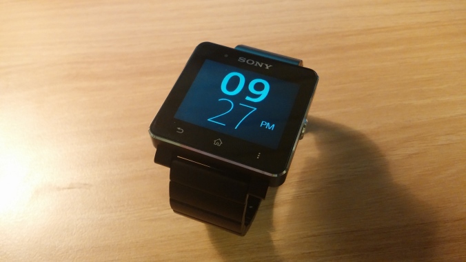
Smartwatch 2 leaves a good first impression. Its metallic build and chamfered edges look suitably high-quality and feel sturdy. Particularly with the metal strap (which I ordered) it looks quite discreet and doesn’t give off the gadget vibe all that much. There’s a power button on the right side, and the typical Android front facing capacitive buttons for back, home and menu on the bottom below the display. The watch face is always showing even without backlight; in this state the device is locked and will not accept any input from the front facing buttons. Pressing the power button on the right turns on the backlight, and either pressing it again or the home button will allow you into the homescreen of the watch proper. Once there, the apps are displayed much as you would find on an Android smartphone, and you swipe sideways to move to the next screen. The notification bar shows the battery status, number of pages, bluetooth icon and the time, and you can swipe down from it to get the notification panel. Before you can delve into the home screen, you need to pair the Smartwatch 2 with an Android phone via bluetooth, and download Smartwatch 2 SW2 application from Google Play Store. All the apps and features of the device are loaded on to it from this app. As well as recommending Sony’s own applications, the app also points you in the way of some notable 3rd party apps. As for the battery life, Smartwatch 2 required charging every 3 days or so, which I found neither great nor terrible.

While I was mostly interested in the music control and the glanceable/on-the-go aspects of Smartwatch 2, I also got to grips with its notification features, an area where wearable devices are expected to perform a useful role. To start off, there are no notification apps pre-installed on the device. The aforementioned SW2 app on the phone recommends applications like Messaging, Gmail and Missed Call, in addition to social network notifications such as Twitter and Facebook. They work as well as you expect them to: emails and text messages are shown clearly and legibly, and are scrollable, so it’s possible to read the whole email (sans photos or other embedded media – just text) on the device. Unread notices are shown on each of the notification app on the watch, and tapping into them will allow you to read any previous email and message. There is another, separate app which shows you how many notifications across different services you have in total. As a medium for notification receipt, Smartwatch 2 is pretty well done and is certainly a better option than Pebble, which will show you emails and messages as and when they arrive, and are gone once checked. If a user’s main expectation for a smart watch is to receive notifications for various services, then Smartwatch 2 fits the bill rather well. It also supports the ability to reply with pre-determined text and to call back an SMS sender from the message. A pretty nifty feature is Call Handling, with which you can dial a number and tap on the phone button from the app on the watch, and the phone will start making the call. An incoming call, however, can only be rejected, not accepted, from the watch. You can also set alarms – simple vibration – and here Smartwatch 2 goes further than Pebble by allowing you to set repeat alarms and choose the days of the week.

It’s in the features other than notification where Smartwatch 2 starts to show its weaknesses. Let’s start with music control, one of my main areas of interest. The most obvious way to control your smartphone’s music playback from the watch is through a Sony-developed app called Music Player Extension, available from the Play Store. It’s a lamentably barebones application: you have the apparent option to choose which music app to control, but when you open up the option the only selection you are given is ‘automatic’, rendering the said option rather redundant. Whichever player you choose to use, the Music Player Extension struggles to show album artwork which the layout of the app suggests it should. Not only that, it’s very hit and miss when it comes to displaying song/artist information, so that all too often there’s no way of telling what or who is currently being played. Skipping tracks is done by swiping sideways, which works well, but controlling volume is tricky because the detection areas for volume up and volume down are absolutely tiny. Everything works, but in a way that makes you feel that Sony could have done a much better job. The Music Player Extension and other apps of its ilk also suffer from significant delay when you tap to open. This is made worse because the watch shows you no indication when you tap an app that the touch has been successful, so that on many occasions I would tap an icon, wait for it to open up, only to realise that the tap wasn’t recognised. A better music control app on the Smartwatch 2 is called Poweramp Control, which oversees playback on the said music application in a more attractive way by succeeding more often than not in displaying artist name, song title and album title as well as album art, in addition to letting you skip tracks and change volume. Again, however, Poweramp Control has tiny hit areas for volume control, has (lesser) delay in launching, and as the name suggests only works with one music player.¹

The technical shortcomings of Smartwatch 2 and the very fact that it’s a touchscreen device present a considerable problem when trying to control music – and make use of the watch in general – on the move. It’s almost impossible to skip tracks or change volume without looking at the device, which is a major hindrance when you are walking or on public transport. Touchscreen control can be prone to imprecision even on full-sized smartphones, so everything is made harder on a 1.6 inch screen, and extremely difficult when you’re trying to hit the volume controls. Given that music control apps on Smartwatch 2 don’t open right away and struggle to show even the basic information about the music, the whole feature makes for a disappointing experience.

As a wristwatch, Smartwatch 2 is inexplicably rudimentary. Compared to Pebble its specification is more robust and has potential for more varied implementation as a time-keeping device, but Sony for some reason has limited the watchface to just 5 built-in options, 2 of them showing time and date, and the others just the time. Only one is a digital clock, and is incidentally the only decent looking watchface; the rest are analogue and look terrible. As far as I can tell, there is no way of installing other watchfaces without resorting to a separate app, which will disappear when the device goes to sleep and reverts to one of the default watchfaces. One of Pebble’s main strengths is the ability to install all kinds of 3rd party watchfaces, which on a practical level means that depending on what you install you can be glancing at more information, like this one. As things stood I could only bear to look at the digital watchface on Smartwatch 2, which unfortunately shows the least amount of data.

After coming up against these shortcomings, I experienced a newfound appreciation for Pebble, and decided to buy a new one to compare and contrast. Limited though it may be overall, Pebble has physical buttons that are more useful for music control on the move, transitions into music control mode immediately upon a couple of button presses, and is capable of much more glanceable information through 3rd party watchface support. Now in possession of both smart watches, Pebble’s appeal to me has become more pronounced. I don’t necessarily think that its simplicity by itself is its major weapon: as far as notification is concerned, Sony’s device is markedly better. But Pebble’s lack of technical complication allows for very streamlined navigation and quick function transitions. There’s a Pebble app called Music Boss, with which you can control pause, play and skip tracks and change volume with just the three physical buttons on the right side of the device. It opens immediately, shows you what’s playing and basically just works every time. There’s no equivalent on Smartwatch 2, unfortunately. Likewise, it’s not just that there are more watchfaces that show more information on Pebble, but rather that they do so dependably. It’s hard to understand why Sony has developed a smart watch that is more sophisticated and ripe for all kinds of glanceable information and yet has chosen to limit its watchface to display less data than the most primitive wristwatches. Also, what is interesting is that Pebble supports accelerometer-activated backlight while Smartwatch 2 doesn’t. What this means is that when you bring your wrist up to look at the watch, the motion triggers the backlight, which is especially useful at night. Granted, Pebble’s accelerometer struggles to work half the time, but the fact that a cheaper, more basic device that was crowdfunded has this feature while Sony’s doesn’t speaks volumes for the philosophy behind the respective products.

My use case is not everyone’s, obviously, but my time with Smartwatch 2 has made me realise that it is far from where the smart watch needs to be at – and the same goes for Pebble to a lesser extent, despite the fact that I find it more useful. For one, I’m not sure that touchscreen interface, at least as used on Smartwatch 2 and based on the generic smartphone layout, is necessarily the way forward for a wearable. It’s fine when the user is static, but the fundamental appeal of wearable devices is that it is on your body at all times and accessible in a way that smartphones aren’t. As such, the focus for smart watches has to be the ease, speed and dependability of control. Your body is less likely to be stable while using a wearable, so the buttons and controls need to take that into account and require less precise, less visually-dependent types of input. In this regard, and against my expectations, I found the physical buttons on Pebble to be preferable. On Smartwatch 2, I found myself wishing that it supported system-wide gesture controls rather than the diminutive front-facing Android buttons or the shrunk-down homescreen navigation, particularly when I was out and about. Presentation of glanceable information is another area where Smartwatch 2 doesn’t get it right. There’s great potential for devices like it to provide the user with lots of useful information extremely quickly and in very convenient ways. On Smartwatch 2, however, the existence of the homescreen itself is very telling. It’s proof that Sony didn’t feel comfortable straying too far from a smartphone mindset, and that its vision of a smart watch was to build a very limited, miniature Android device and then added a watchface on top of it. Given that there is no way to feed any additional information to the watchface itself, and that you have to delve into the homescreen and deal with the undersized icons to access proper information, Smartwatch 2’s glanceability is lost and the benefit of having such a watch is reduced.

Looking at the ways in which Smartwatch 2 falls short, I think that trying to get the smart watch to be a miniature smartphone on your wrist is the wrong way of going about it. A smart watch manufacturer should concentrate on getting a few things to work right, quickly and reliably. The device should not require you to peel through layers of the user interface to get to the feature you’re looking for, because it negates the purpose of a wearable. Ideally it should enable you to bring up the information or access the function you’re looking for with a single press, tap or gesture, by having specific buttons or hot corners that are assigned to particular functions like message notification and music control. In this way you can access the feature you need without having to think too much or make additional movements. Surely the point of products like Google Glass or Pebble is that the information they present is more naturally, perhaps even instinctively, accessible. No doubt this means that the number of features that the watch can support will be significantly limited, but I think that should actually be the aim for smart watch makers. Because of this, the selection and quality of the features to which the buttons/gestures are assigned will be vital, and thus the onus will be on the manufacturer (as opposed to app developers). Finally, the watchface should be treated with much more thought and imagination. It’s what the user will be looking at every single time she or he uses the device. Having it be customisable like Pebble would be good; a location-based watchface that displays different information depending on where you are would be interesting², notwithstanding reliability and battery life issues. Rather than acting as a secondary unit leeching off the smartphone’s data, a smart watch should at least have some ability to acquire and process data natively and then pump it up to the watchface. Whatever it is, don’t make it like Smartwatch 2’s watchfaces: uninformative, restrictive, unsightly and anything but smart.


_____________________

¹All this was tested on LG G2, as the Music Player Extension did not support KitKat on Nexus 5 at all, while Poweramp Control eventually did after an update.

² This is something that according to rumours Google’s smart watch will be doing, using Google Now-style cards.